somewhere between LA and San Diego

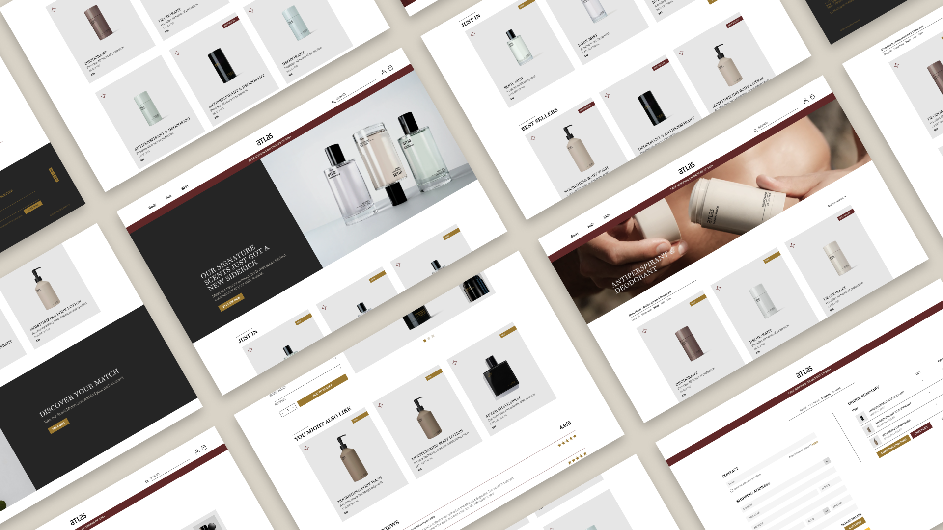

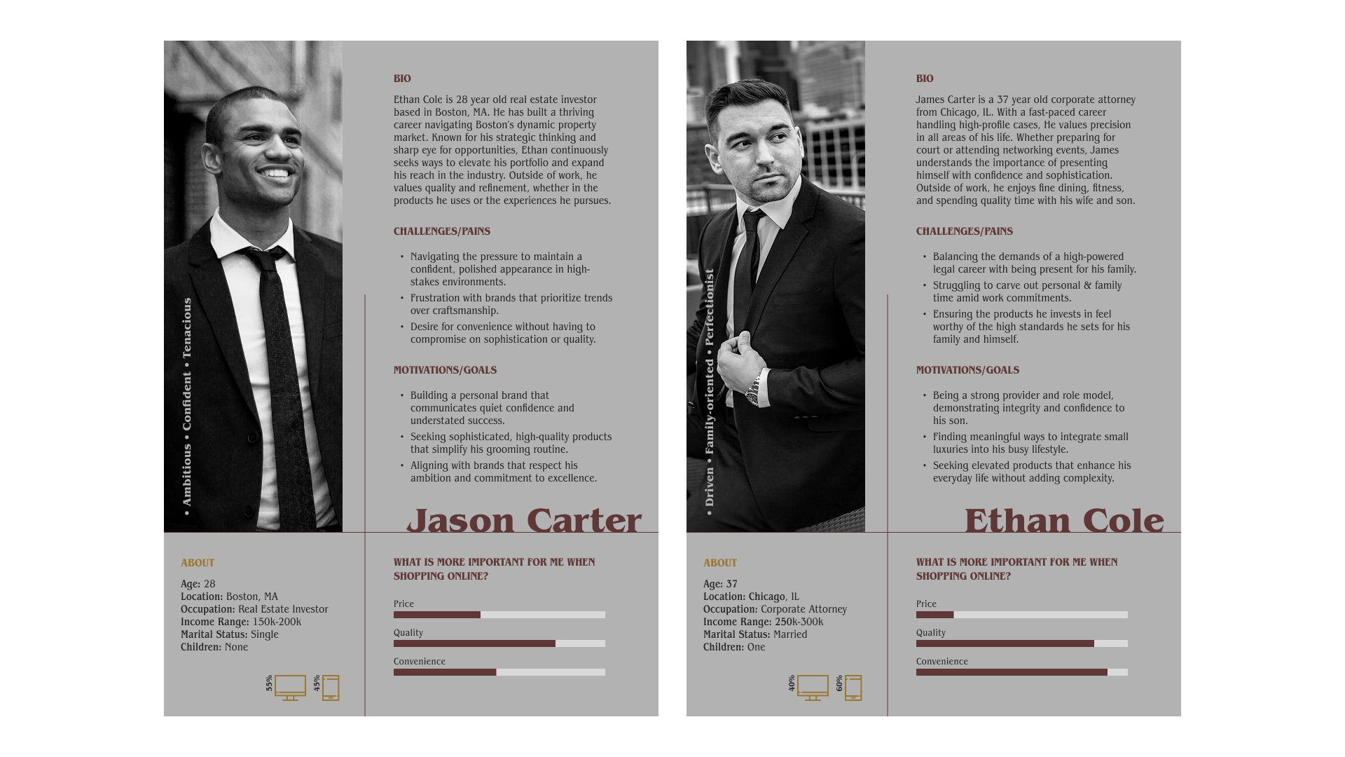
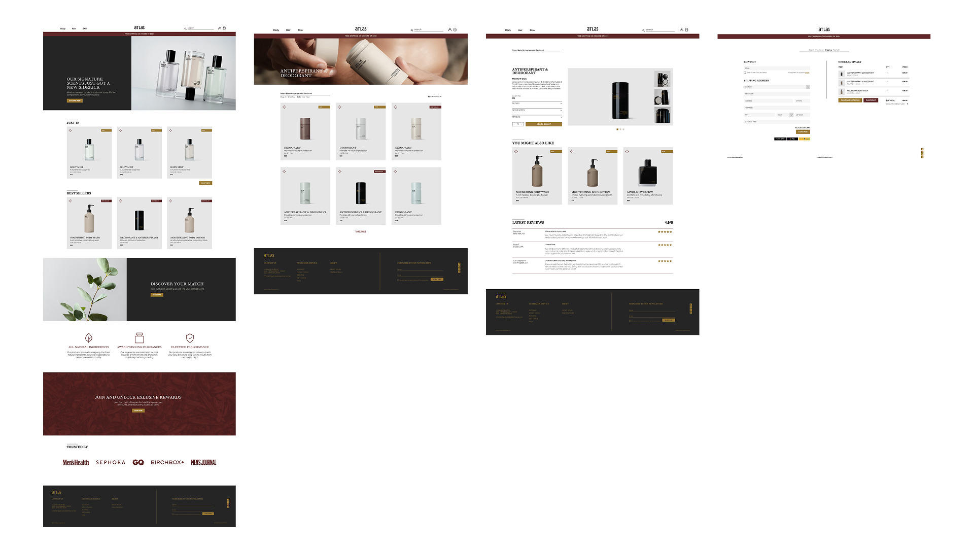
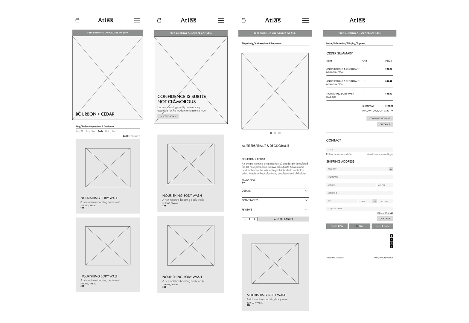
Atlas in an e-commerce website for self-care daily essentials targeted at men. The Atlas customer is one who values high quality and performance over price and/or flashy design. They appreciate simplicity and overall craftsmanship excelence.
Logo design / branding / website / mobile / animation
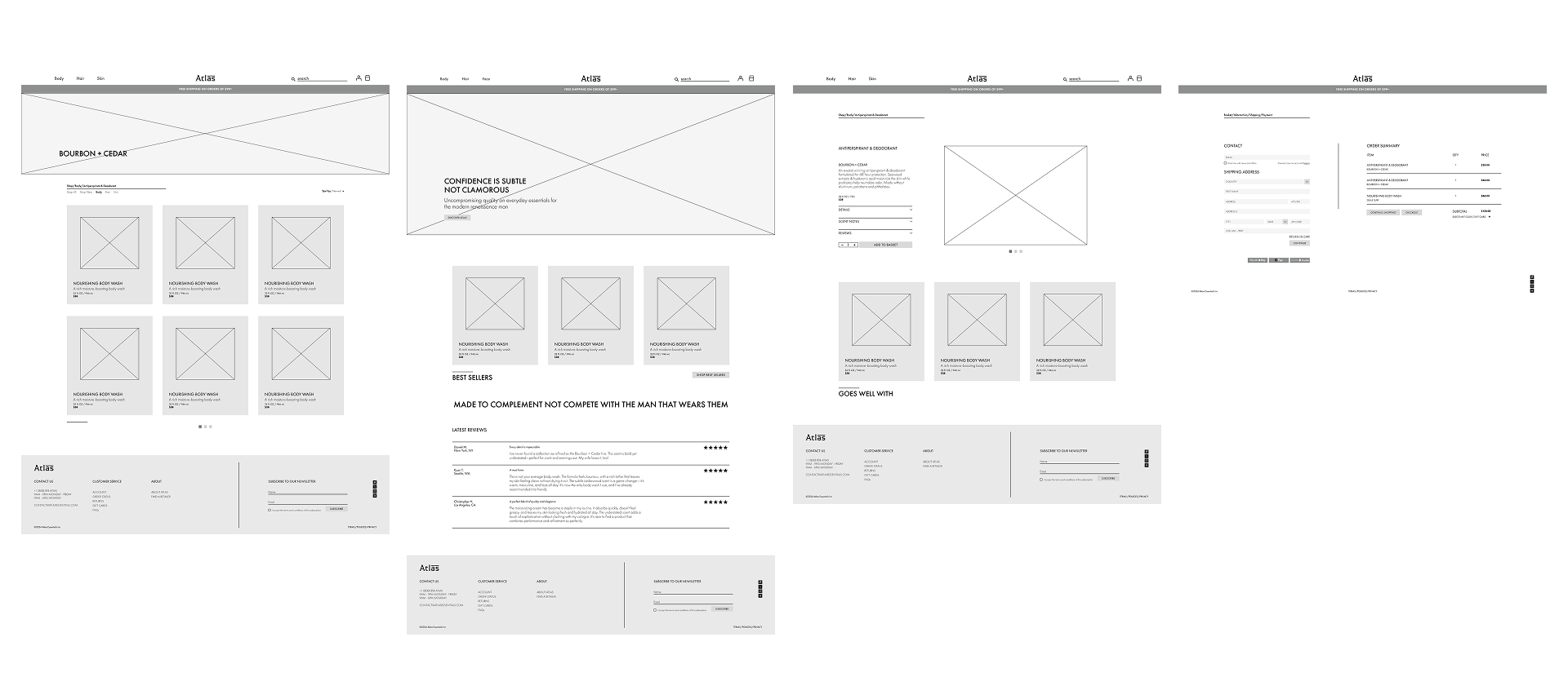
E-commerce / web design / mobile design
Sean Bacon / Bradford Prairie
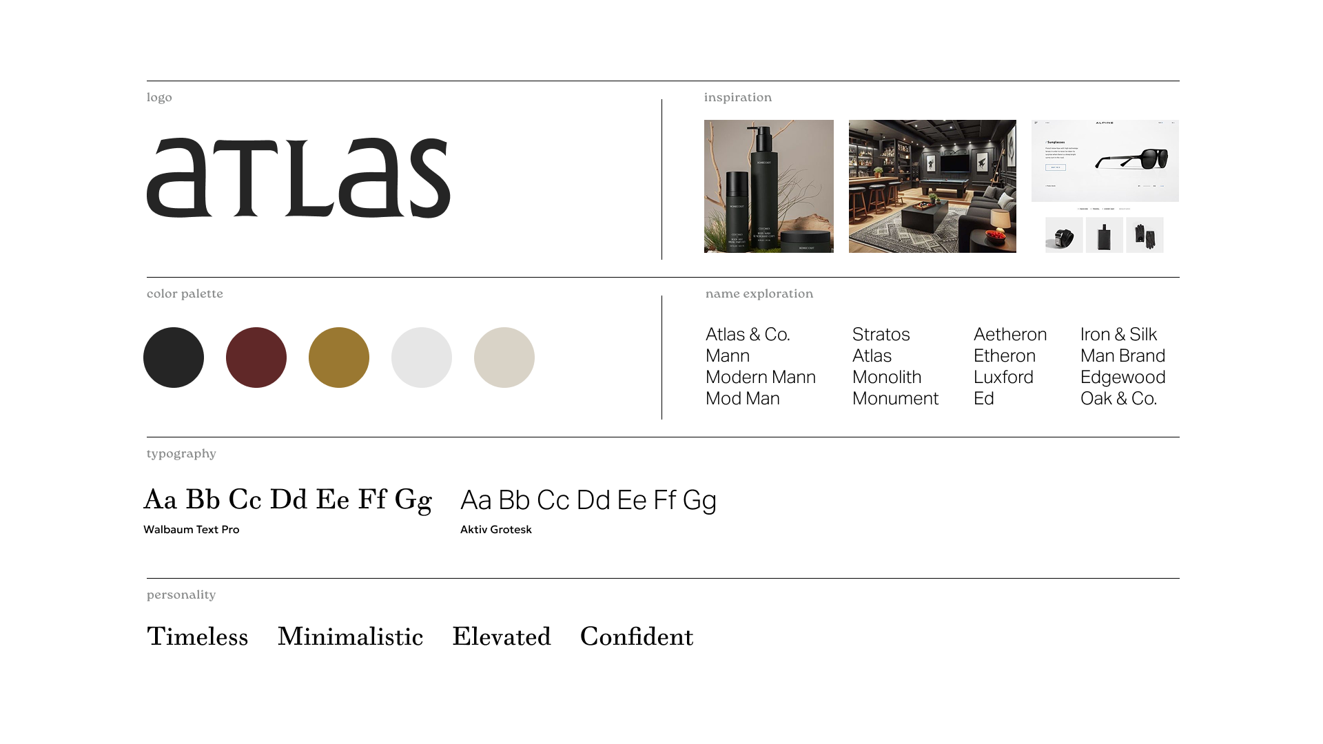
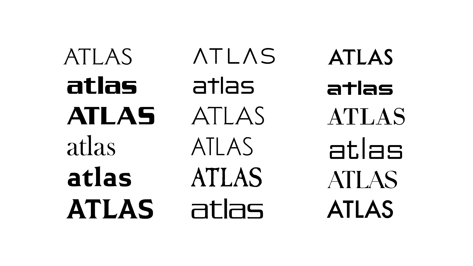
The Atlas logo began with exploring typefaces that felt masculine yet elegant. Ultimately, the logo became a blend of both uppercase and lowercase characters to solve awkward spacing between the "L" and "A". A modified "A" gave it a special touch highlighting the craftmanship element. Keeping a simple color palette and clean product design was necessary to match the emotion Atlas seeks to deliver. Less is more, keeping design minimalistic and modern allowed the richness of the brand to speak for itself.